

Chart- A chart, also called a graph, is a
graphical representation of data, in which "the data is represented by
symbols, such as bars in a bar chart, lines in a line chart etc.
Types of charts-
1. Line
2. Bar
3. Pie
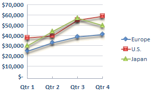
1. Line Chart- In a line chart data is arranged in columns
or rows on a worksheet and line chart is used to display continuous data over
time. In a line chart category data is distributed evenly along the horizontal
axis and all data value is distributed evenly along the vertical axis.
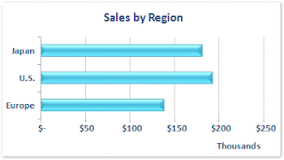
2. Bar Chart- A bar chart is used to compare individual
items. In this type of chart categories are organised vertically and values are
organised horizontally.
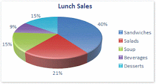
3. Pie Chart- Pie chart show the size of items in one data series, comparative to the sum of the items. The data points in a pie chart are displayed as a percentage
of the whole pie.
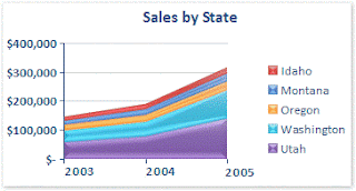
4. Area Chart- Area
charts highlight the level of change over time, and can be used to draw
attention to the total value across a movement.
For example, data that represents profit over time can be represented in
an area chart.
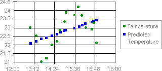
5. Scatter
Chart- Scatter charts show the
relationships among two groups of
numbers as one series. A scatter
chart has two value axes, horizontal axis (x-axis) and vertical axis (y-axis). It combines
these values into single data points and displays them in
uneven intervals.
Scatter charts are commonly used for displaying
and comparing numeric values, such as scientific, statistical, and engineering
data.
To arrange data on a worksheet for a scatter chart, we should place the
x values in one row or column, and then y values in the next rows or columns.
UNIT-104
Digital Data Tabulation-Spreadsheet
- Introduction and Concepts of Spreadsheet and Workbook
- How to Create, Save, Open, Preview, Print and Close Worksheet
- How to Enter Numbers, Text, Date and Time, Series using Auto Fill
- Editing and Formatting of Worksheet
- Changing Color, Size, Font, Alignment of Text
- Inserting/Deleting cells, Rows and Columns
- Entering Formula in cell using operator (+, -, x, /) etc
- Cell Referencing(Relative, Absolute and Mixed)
- Functions(SUM, AVERAGE, MAX, MIN, IF)
- Inserting tables in Worksheet
- Charts(Lines, Pie, Bar, Column, Area)
- Macros in Worksheet